Kanri v0.6 launch
The new big release of Kanri is out, featuring a lot of small improvements and new features.
tl;dr: Kanri v0.6 adds a lot of miscellaneous fixes and new features such as custom colors for cards, rich text in card descriptions and the ability to edit columns in the board creation popup. To find out what has changed exactly, read on!

New features
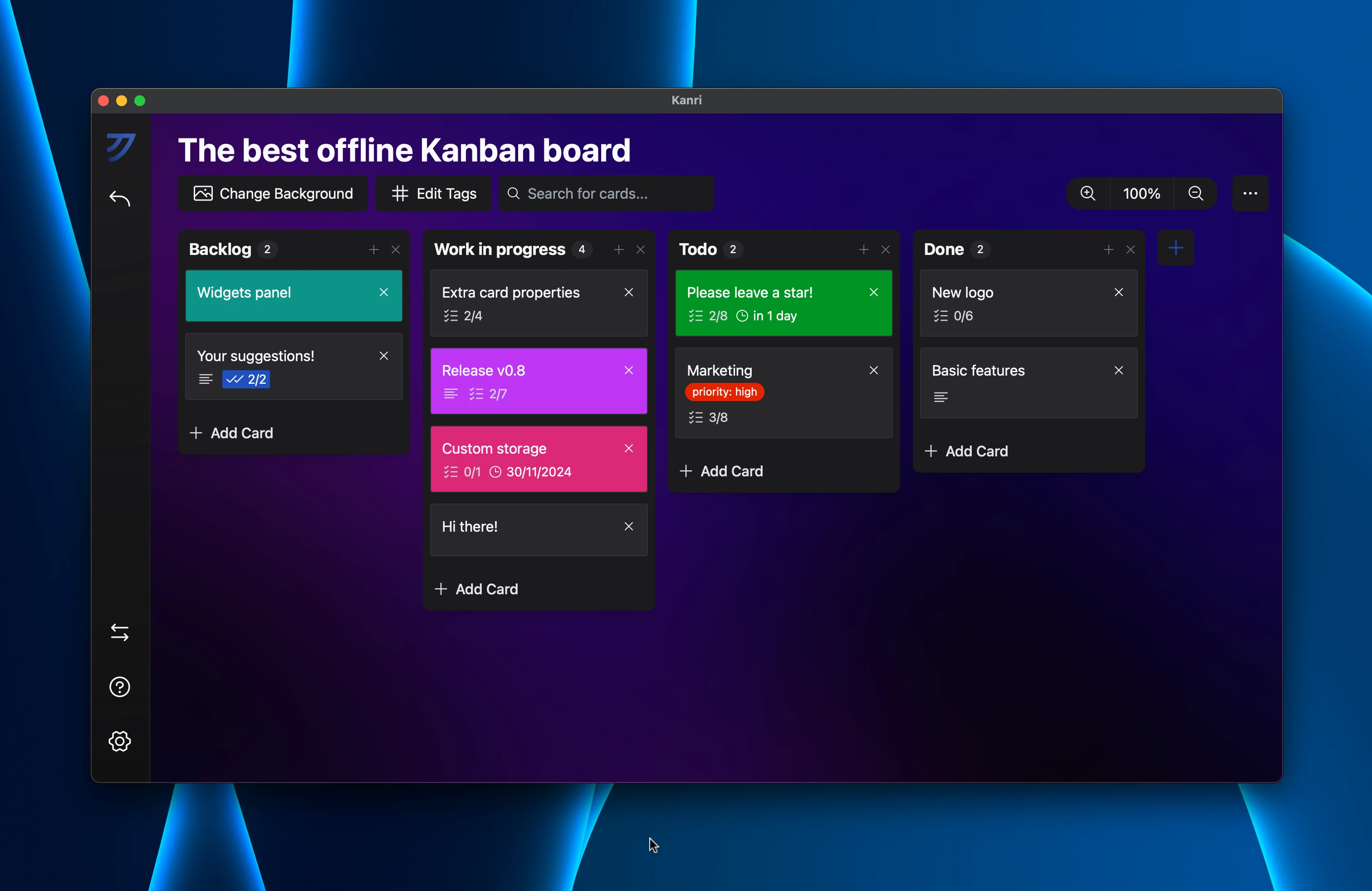
The primary focus of this release was to improve the properties of Kanban cards, which compared to other solutions were quite lackluster. While this release doesn’t tackle some major planned additions like card tags or due dates, these features work towards improving the general capabilities of cards.
Custom card colors
Thanks to @Khusyasy on GitHub, you can now select custom colors for cards as opposed to just a fixed palette. The color picker uses the one native to your system - if this bothers you and would like an improved and unified color picker across all platforms, please reach out to trobo@kanriapp.com.

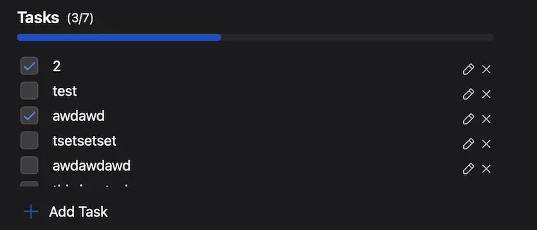
Progress indicator for card tasks
Previously, you were unable to have an overview of your completion progress on cards with a lot of tasks. With the addition of a progress bar inside the card popup, this has been resolved.

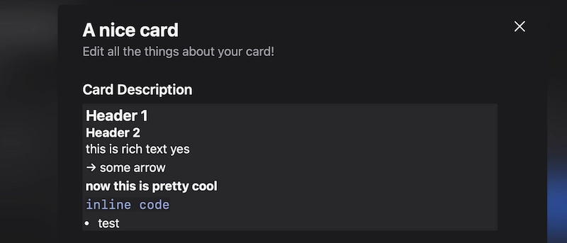
Rich text card descriptions
Using TipTap, your cards now have support for rich text! Many formatting styles are available and can be toggled using shortcuts similar to Markdown. Clickable links are not supported for security purposes since your data is stored in a JSON file which could be changed externally.

Other miscellaneous features and fixes
Here’s a selection of other notable changes in the release. To see all changes, please check the changelog in the GitHub release.
Option to disable all animations from settings
Because the app can be a bit sluggish with animations on Linux (because of the GTK WebKit webview which seems to be struggling here), the option to disable all animations should make the app feel more responsive and snappy. This is also recommended for lower-end systems that also struggle with these animations.
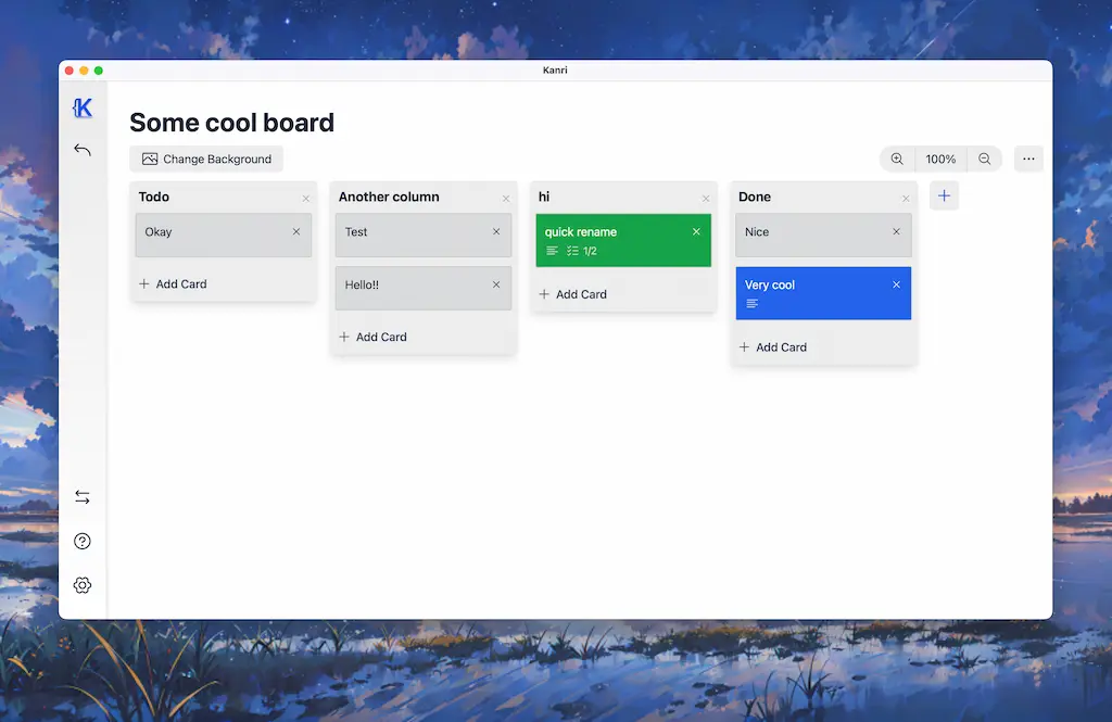
Improved light mode
Thanks to @pnxl on GitHub, light mode colors have been improved, with better contrast and overall more coherent aesthetics.

Contrast improvements
The contrast/visibility of elements in a lot of areas of the app like in the double click quick edit for cards or the title of a board with a custom background image has been improved to make using the app easier.
Next steps
In the future, expect to see development slow down a bit more as I will be a bit more busy with personal matters. To see my ideas and vision for the project, you can check the GitHub readme and the roadmap. Nevertheless, the project is open to contributions and I am happy to check them out (please just make sure to communicate before jumping into something to prevent your changes being rejected).
If all of this sounds interesting to you, you can download Kanri v0.6 here.
Thanks to everyone who made this release possible! If you enjoy Kanri, please make sure to leave a star on GitHub, as it does not make any profits and your support is the only way to keep it alive.